2021
Ocho App Redesign
Ocho App Redesign
A strategic redesign of Ocho’s visual identity and mobile app—aimed at refreshing the brand’s perception, enhancing usability, and reconnecting with its community.
Branding
UI/UX Design
Know More
This redesign was not just about a new look—it was about aligning the brand with the values of connection, simplicity, and everyday joy.
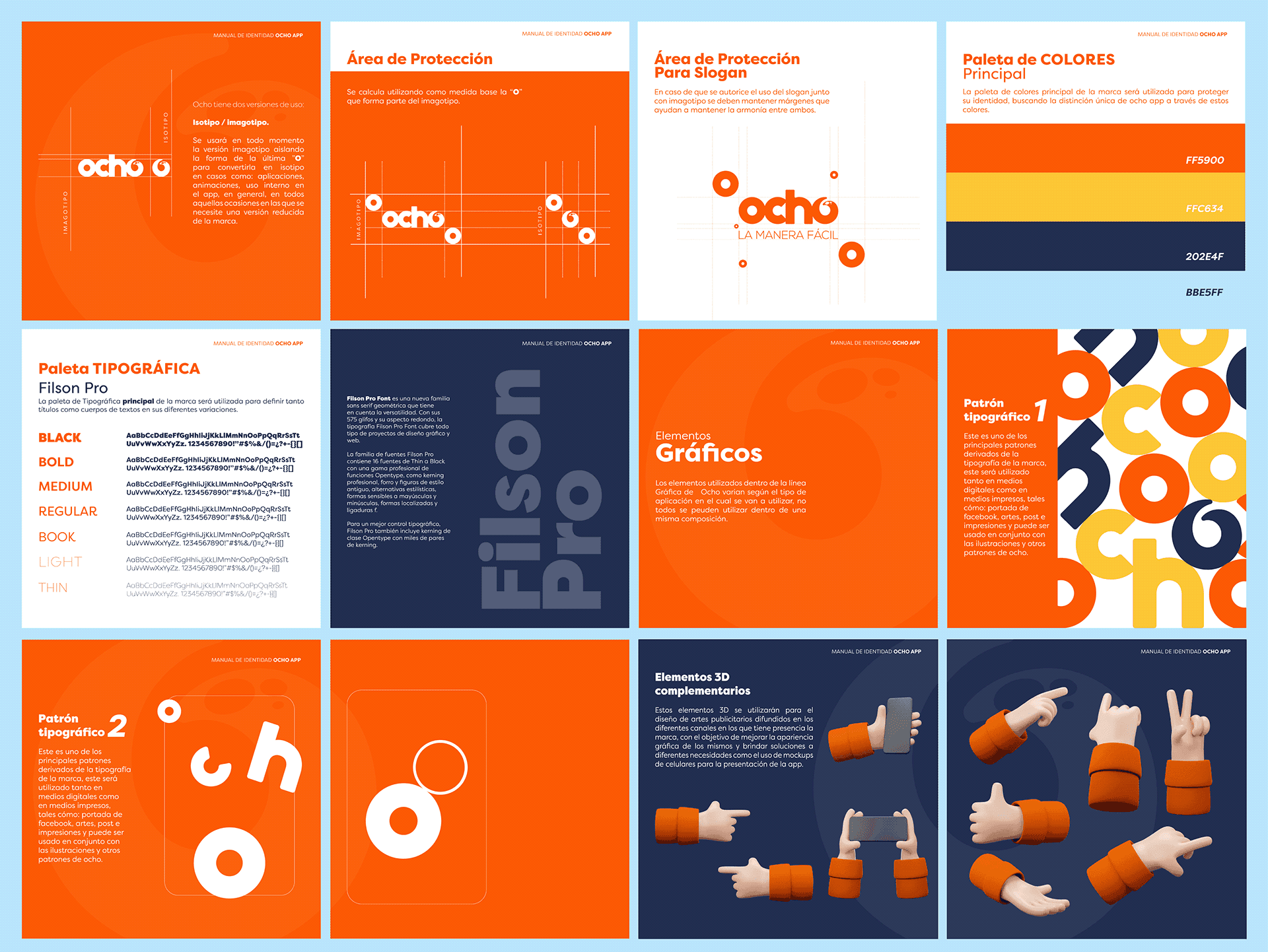
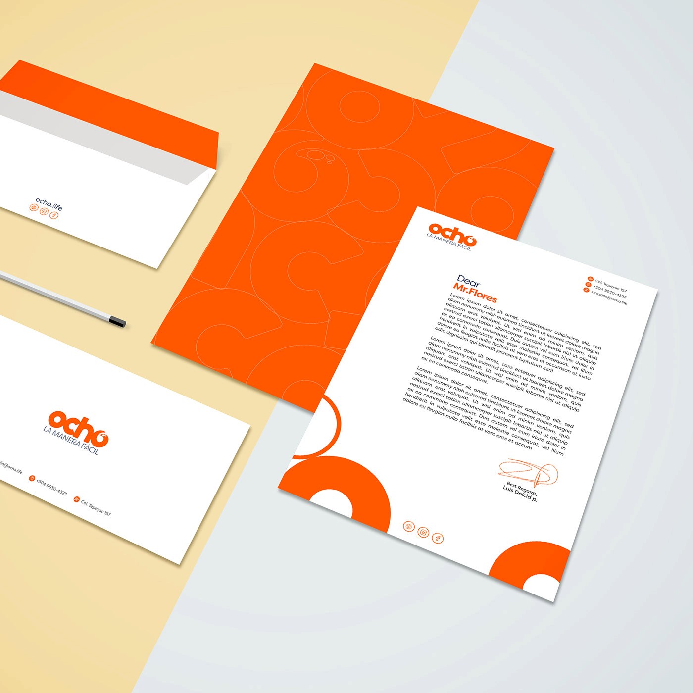
We refreshed the entire visual identity and digital experience with a more youthful, vibrant, and intuitive direction. Using 3D iconography, playful colors, and simplified navigation, we gave the app a personality that’s easy to love and instantly recognizable. The result is a brand that feels modern yet local—approachable, joyful, and built for people’s everyday moments.

Problem
The brand was facing a growing perception problem. Its visual identity was outdated and lacked emotional connection, while the app itself was difficult to navigate and aesthetically disconnected from its users—especially younger audiences looking for a smooth and fun experience.
People weren’t just frustrated by usability—they were losing trust in the brand. The lack of cohesion between the app and the broader communication strategy made Ocho feel inconsistent. This redesign became essential to restore confidence, differentiate from competitors, and re-establish Ocho as a relatable, lifestyle-oriented delivery service.

Solution
We executed a 360° redesign across all touchpoints, both digital and visual. From rethinking the brand tone to redesigning the app interface, every decision focused on clarity, friendliness, and functionality. The refreshed design brought harmony between the brand promise and user experience.
Inside the app, we introduced a new system of 3D icons to represent each category, making navigation more intuitive and visually engaging. Colors were optimized for legibility and brand recall, while layouts were simplified to reduce friction. The overall result was not just a better-looking app—it was a tool that users could connect with emotionally and practically.

Concept
This project wasn’t just a facelift—it was a strategic evolution. The core idea was to position Ocho as a service that enhances life’s best moments through design. The visual system is built on balance: playful yet simple, modern yet familiar, tech-forward yet human.
By integrating design deeply into every aspect of the brand, Ocho reclaimed its place in people’s daily lives—not just as a delivery service, but as a lifestyle companion. The redesign helped reinforce its promise: to simplify, delight, and deliver with personality.

More Works
(GQ® — 02)
©2024

FAQ
01
What does a typical project look like?
02
How is the pricing structured?
03
What’s needed to get started?
04
Do I need to know how to code?
05
How do we measure success?
2021
Ocho App Redesign
A strategic redesign of Ocho’s visual identity and mobile app—aimed at refreshing the brand’s perception, enhancing usability, and reconnecting with its community.
Branding
UI/UX Design
Know More
This redesign was not just about a new look—it was about aligning the brand with the values of connection, simplicity, and everyday joy.
We refreshed the entire visual identity and digital experience with a more youthful, vibrant, and intuitive direction. Using 3D iconography, playful colors, and simplified navigation, we gave the app a personality that’s easy to love and instantly recognizable. The result is a brand that feels modern yet local—approachable, joyful, and built for people’s everyday moments.
Problem
The brand was facing a growing perception problem. Its visual identity was outdated and lacked emotional connection, while the app itself was difficult to navigate and aesthetically disconnected from its users—especially younger audiences looking for a smooth and fun experience.
People weren’t just frustrated by usability—they were losing trust in the brand. The lack of cohesion between the app and the broader communication strategy made Ocho feel inconsistent. This redesign became essential to restore confidence, differentiate from competitors, and re-establish Ocho as a relatable, lifestyle-oriented delivery service.
Solution
We executed a 360° redesign across all touchpoints, both digital and visual. From rethinking the brand tone to redesigning the app interface, every decision focused on clarity, friendliness, and functionality. The refreshed design brought harmony between the brand promise and user experience.
Inside the app, we introduced a new system of 3D icons to represent each category, making navigation more intuitive and visually engaging. Colors were optimized for legibility and brand recall, while layouts were simplified to reduce friction. The overall result was not just a better-looking app—it was a tool that users could connect with emotionally and practically.
Concept
This project wasn’t just a facelift—it was a strategic evolution. The core idea was to position Ocho as a service that enhances life’s best moments through design. The visual system is built on balance: playful yet simple, modern yet familiar, tech-forward yet human.
By integrating design deeply into every aspect of the brand, Ocho reclaimed its place in people’s daily lives—not just as a delivery service, but as a lifestyle companion. The redesign helped reinforce its promise: to simplify, delight, and deliver with personality.
More Works
(GQ® — 02)
©2024
FAQ
01
What does a typical project look like?
02
How is the pricing structured?
03
What’s needed to get started?
04
Do I need to know how to code?
05
How do we measure success?
2021
Ocho App Redesign
A strategic redesign of Ocho’s visual identity and mobile app—aimed at refreshing the brand’s perception, enhancing usability, and reconnecting with its community.
Branding
UI/UX Design
Know More
This redesign was not just about a new look—it was about aligning the brand with the values of connection, simplicity, and everyday joy.
We refreshed the entire visual identity and digital experience with a more youthful, vibrant, and intuitive direction. Using 3D iconography, playful colors, and simplified navigation, we gave the app a personality that’s easy to love and instantly recognizable. The result is a brand that feels modern yet local—approachable, joyful, and built for people’s everyday moments.
Problem
The brand was facing a growing perception problem. Its visual identity was outdated and lacked emotional connection, while the app itself was difficult to navigate and aesthetically disconnected from its users—especially younger audiences looking for a smooth and fun experience.
People weren’t just frustrated by usability—they were losing trust in the brand. The lack of cohesion between the app and the broader communication strategy made Ocho feel inconsistent. This redesign became essential to restore confidence, differentiate from competitors, and re-establish Ocho as a relatable, lifestyle-oriented delivery service.
Solution
We executed a 360° redesign across all touchpoints, both digital and visual. From rethinking the brand tone to redesigning the app interface, every decision focused on clarity, friendliness, and functionality. The refreshed design brought harmony between the brand promise and user experience.
Inside the app, we introduced a new system of 3D icons to represent each category, making navigation more intuitive and visually engaging. Colors were optimized for legibility and brand recall, while layouts were simplified to reduce friction. The overall result was not just a better-looking app—it was a tool that users could connect with emotionally and practically.
Concept
This project wasn’t just a facelift—it was a strategic evolution. The core idea was to position Ocho as a service that enhances life’s best moments through design. The visual system is built on balance: playful yet simple, modern yet familiar, tech-forward yet human.
By integrating design deeply into every aspect of the brand, Ocho reclaimed its place in people’s daily lives—not just as a delivery service, but as a lifestyle companion. The redesign helped reinforce its promise: to simplify, delight, and deliver with personality.
More Works
©2024
FAQ
What does a typical project look like?
How is the pricing structured?
What’s needed to get started?
Do I need to know how to code?
How do we measure success?