2024-2025
Compi App Redesign
Compi App Redesign
A comprehensive redesign of Compi’s mobile application, aimed at enhancing user experience and developer workflow through UX/UI best practices, visual clarity, and thoughtful personalization.
UX/UI Desing
Product Desing
Know More
Compi is a growing tech startup focused on delivering human-centered technology. As part of its product evolution, I led the redesign of its mobile application to address usability gaps, elevate the brand experience, and streamline collaboration between design and development.
A Truly Magical Experience!
The project was developed by the in-house design team I had the privilege of leading at Compi Technologies. Special acknowledgment to Stephany Rodríguez, a key design contributor throughout the process, and Junior Amador, who created the custom illustrations under my art direction. Their talent and collaboration were instrumental in bringing the vision to life.

Problem
The original app design lacked a Design System, clear style guidelines, and proper component usage in Figma. This caused serious inefficiencies for the development team, who faced difficulties in interpreting layouts, spacing, and visual logic.
Beyond technical flaws, the UI did not reflect the innovation and care Compi promises its users. Without structured visuals and a user-centered approach, the product felt outdated, inconsistent, and out of alignment with user expectations.


Solution
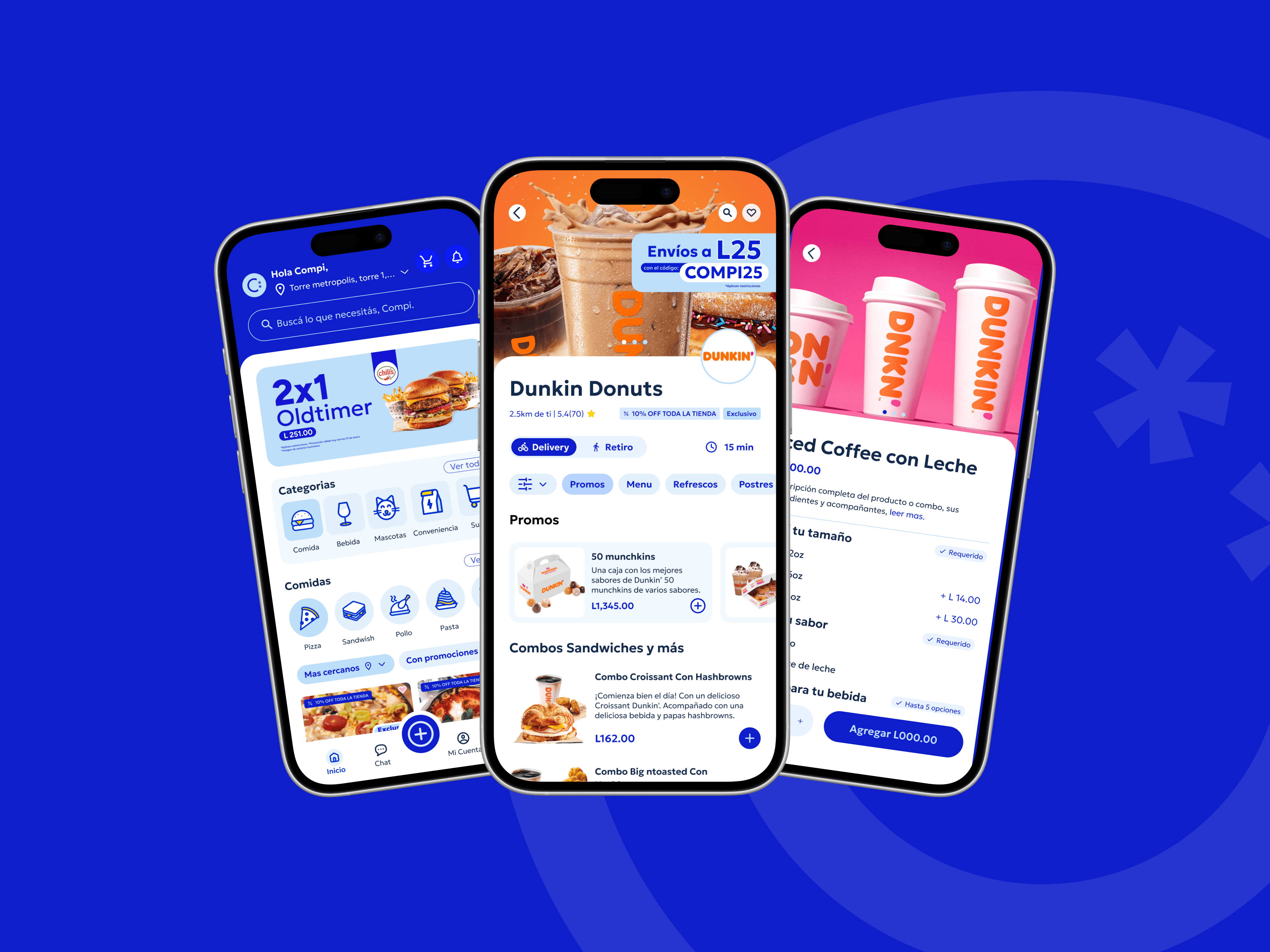
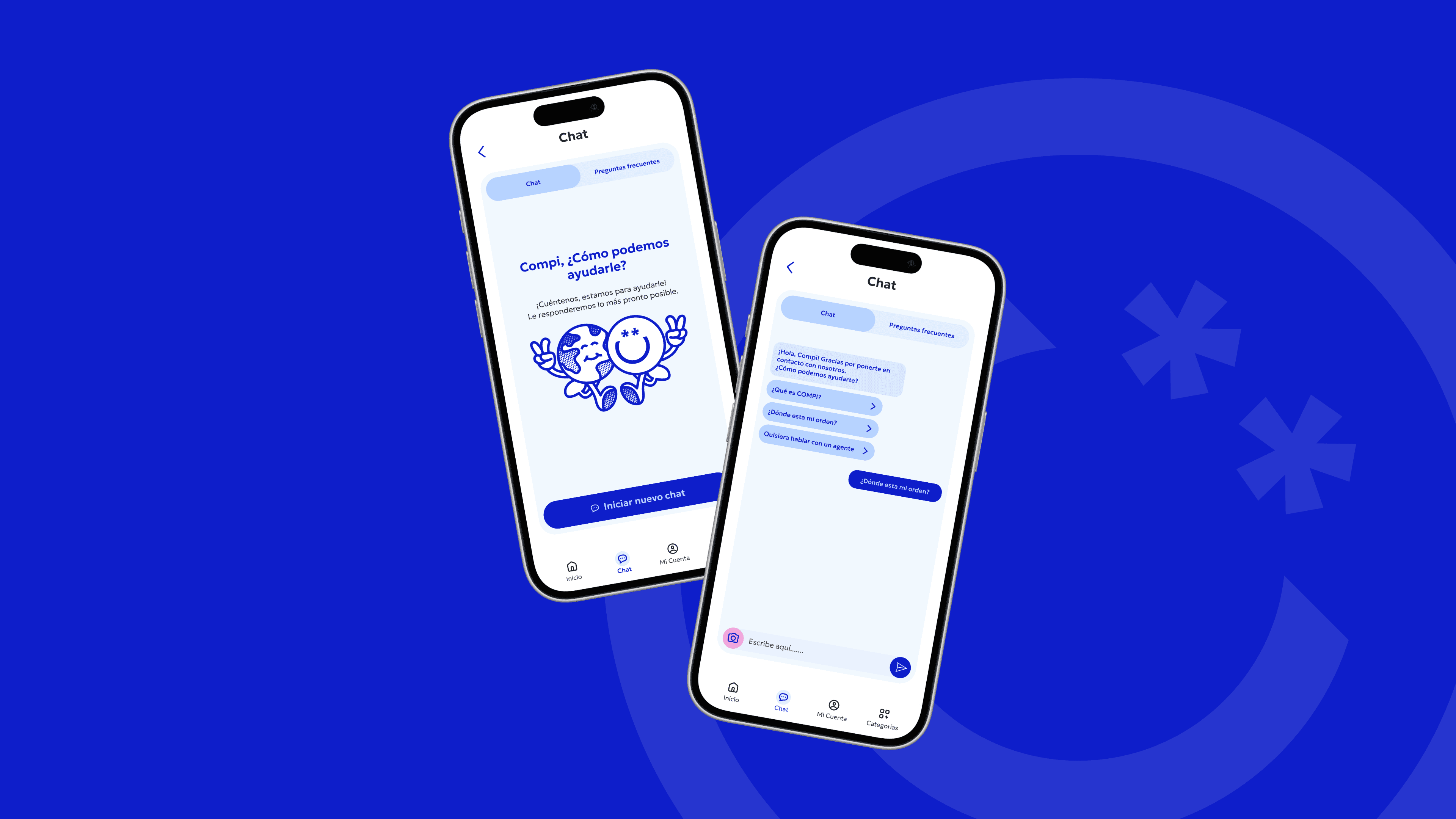
We restructured the app using modern UX/UI practices. A full Design System was implemented, along with auto-layouts, consistent components, and clearly defined tokens for color and typography. These improvements allowed seamless integration with Figma’s Developer Mode, streamlining the design-to-development pipeline.
The visual and functional enhancements created a smoother experience for both users and developers. Navigational flows were simplified, while the interface was refreshed with a youthful, brand-aligned tone—making it more accessible, dynamic, and aligned with Compi’s values: transparency, innovation, and human warmth.
Concept
The redesign was built around the concept of emotional UX—inspired by Donald Norman’s model of visceral, behavioral, and reflective design. We focused on intuitive layouts, user anticipation, and subtle feedback mechanisms to enhance trust and engagement.
The app now delivers a cleaner, more structured experience. Categories are personalized based on user habits, favorite vendors are featured prominently, and navigation flows are simplified. With friendly illustrations and thoughtful visual hierarchy, the interface feels smart, responsive, and truly aligned with the user’s needs.

More Works
(GQ® — 02)
©2024
FAQ
01
What does a typical project look like?
02
How is the pricing structured?
03
What’s needed to get started?
04
Do I need to know how to code?
05
How do we measure success?
2024-2025
Compi App Redesign
A comprehensive redesign of Compi’s mobile application, aimed at enhancing user experience and developer workflow through UX/UI best practices, visual clarity, and thoughtful personalization.
UX/UI Desing
Product Desing
Know More
Compi is a growing tech startup focused on delivering human-centered technology. As part of its product evolution, I led the redesign of its mobile application to address usability gaps, elevate the brand experience, and streamline collaboration between design and development.
A Truly Magical Experience!
The project was developed by the in-house design team I had the privilege of leading at Compi Technologies. Special acknowledgment to Stephany Rodríguez, a key design contributor throughout the process, and Junior Amador, who created the custom illustrations under my art direction. Their talent and collaboration were instrumental in bringing the vision to life.
Problem
The original app design lacked a Design System, clear style guidelines, and proper component usage in Figma. This caused serious inefficiencies for the development team, who faced difficulties in interpreting layouts, spacing, and visual logic.
Beyond technical flaws, the UI did not reflect the innovation and care Compi promises its users. Without structured visuals and a user-centered approach, the product felt outdated, inconsistent, and out of alignment with user expectations.
Solution
We restructured the app using modern UX/UI practices. A full Design System was implemented, along with auto-layouts, consistent components, and clearly defined tokens for color and typography. These improvements allowed seamless integration with Figma’s Developer Mode, streamlining the design-to-development pipeline.
The visual and functional enhancements created a smoother experience for both users and developers. Navigational flows were simplified, while the interface was refreshed with a youthful, brand-aligned tone—making it more accessible, dynamic, and aligned with Compi’s values: transparency, innovation, and human warmth.
Concept
The redesign was built around the concept of emotional UX—inspired by Donald Norman’s model of visceral, behavioral, and reflective design. We focused on intuitive layouts, user anticipation, and subtle feedback mechanisms to enhance trust and engagement.
The app now delivers a cleaner, more structured experience. Categories are personalized based on user habits, favorite vendors are featured prominently, and navigation flows are simplified. With friendly illustrations and thoughtful visual hierarchy, the interface feels smart, responsive, and truly aligned with the user’s needs.
More Works
©2024
FAQ
What does a typical project look like?
How is the pricing structured?
What’s needed to get started?
Do I need to know how to code?
How do we measure success?