
2020
Copán Ruinas
Copán Ruinas
A vibrant brand identity inspired by the culture and landmarks of Copán Ruinas—designed to promote tourism with clarity, color, and charm.
Branding
Graphic Design
Know More
This project blends iconic shapes and vivid colors representing the town’s main attractions. The result: a flexible, welcoming symbol that celebrates local identity and invites exploration.
Great Brand Desing
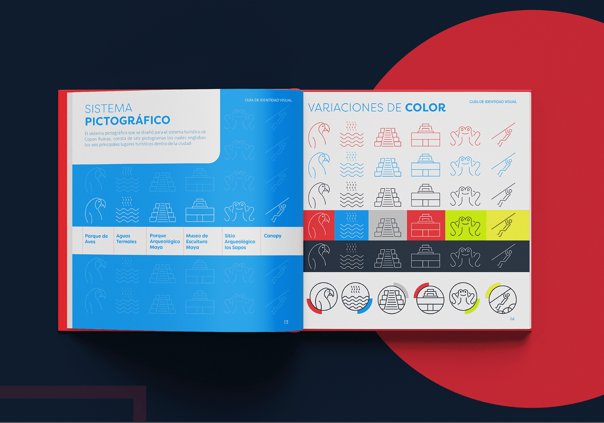
Drawing from the iconic landmarks and vibrant atmosphere of Copán Ruinas, this branding project transforms culture into design. Each symbol represents a key tourist attraction, while the color palette evokes warmth, energy, and diversity. Together, these elements form a modern, cohesive visual identity aimed at boosting the city's image and promoting tourism in an authentic and engaging way.
Problem
In many small cities with rich histories, outdated or generic visual identities often fail to reflect the true depth of their culture. Copán Ruinas lacked a unified brand that could both honor its heritage and appeal to modern travelers.
Tourism-driven towns often struggle to visually express their uniqueness in a way that resonates across print, digital, and environmental applications. Without a consistent identity, efforts to attract visitors can feel fragmented or uninspired. Copán Ruinas needed a fresh, authentic look that captured its soul while being adaptable, recognizable, and full of local meaning.

Solution
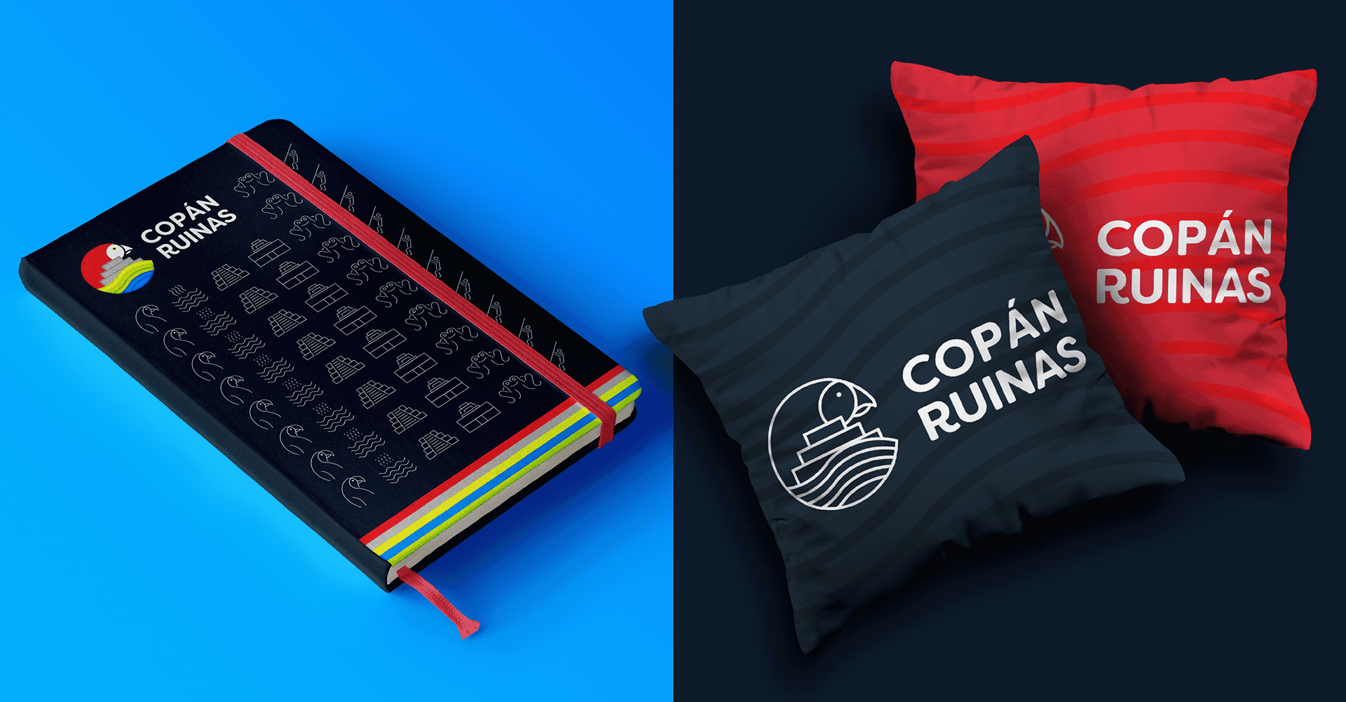
The Copán Ruinas brand was built as a vibrant visual system rooted in local symbolism. By turning key landmarks into graphic forms and matching them with expressive colors, we created a cohesive icon that’s easy to apply across platforms—from city signage to merchandise and digital campaigns.
The identity not only reflects pride in the town's heritage but also positions Copán as a visually striking and culturally rich destination. Through simplicity, modularity, and emotion, the brand invites both locals and visitors to see the city through a renewed lens.

Concept
More than just a logo, Copán Ruinas is a visual language designed to celebrate place, memory, and identity.
The modular icon reflects unity among diversity, bringing together colors and shapes that speak to Copán’s most emblematic locations. It’s friendly, flexible, and designed to adapt—just like the city it represents. With this brand, the goal is not only to elevate tourism, but to give the community a symbol they can identify with and be proud to share with the world.

More Works
(GQ® — 02)
©2024

FAQ
01
What does a typical project look like?
02
How is the pricing structured?
03
What’s needed to get started?
04
Do I need to know how to code?
05
How do we measure success?
2020
Copán Ruinas
A vibrant brand identity inspired by the culture and landmarks of Copán Ruinas—designed to promote tourism with clarity, color, and charm.
Branding
Graphic Design
Know More
This project blends iconic shapes and vivid colors representing the town’s main attractions. The result: a flexible, welcoming symbol that celebrates local identity and invites exploration.
Great Brand Desing
Drawing from the iconic landmarks and vibrant atmosphere of Copán Ruinas, this branding project transforms culture into design. Each symbol represents a key tourist attraction, while the color palette evokes warmth, energy, and diversity. Together, these elements form a modern, cohesive visual identity aimed at boosting the city's image and promoting tourism in an authentic and engaging way.
Problem
In many small cities with rich histories, outdated or generic visual identities often fail to reflect the true depth of their culture. Copán Ruinas lacked a unified brand that could both honor its heritage and appeal to modern travelers.
Tourism-driven towns often struggle to visually express their uniqueness in a way that resonates across print, digital, and environmental applications. Without a consistent identity, efforts to attract visitors can feel fragmented or uninspired. Copán Ruinas needed a fresh, authentic look that captured its soul while being adaptable, recognizable, and full of local meaning.
Solution
The Copán Ruinas brand was built as a vibrant visual system rooted in local symbolism. By turning key landmarks into graphic forms and matching them with expressive colors, we created a cohesive icon that’s easy to apply across platforms—from city signage to merchandise and digital campaigns.
The identity not only reflects pride in the town's heritage but also positions Copán as a visually striking and culturally rich destination. Through simplicity, modularity, and emotion, the brand invites both locals and visitors to see the city through a renewed lens.
Concept
More than just a logo, Copán Ruinas is a visual language designed to celebrate place, memory, and identity.
The modular icon reflects unity among diversity, bringing together colors and shapes that speak to Copán’s most emblematic locations. It’s friendly, flexible, and designed to adapt—just like the city it represents. With this brand, the goal is not only to elevate tourism, but to give the community a symbol they can identify with and be proud to share with the world.
More Works
(GQ® — 02)
©2024
FAQ
01
What does a typical project look like?
02
How is the pricing structured?
03
What’s needed to get started?
04
Do I need to know how to code?
05
How do we measure success?
2020
Copán Ruinas
A vibrant brand identity inspired by the culture and landmarks of Copán Ruinas—designed to promote tourism with clarity, color, and charm.
Branding
Graphic Design
Know More
This project blends iconic shapes and vivid colors representing the town’s main attractions. The result: a flexible, welcoming symbol that celebrates local identity and invites exploration.
Great Brand Desing
Drawing from the iconic landmarks and vibrant atmosphere of Copán Ruinas, this branding project transforms culture into design. Each symbol represents a key tourist attraction, while the color palette evokes warmth, energy, and diversity. Together, these elements form a modern, cohesive visual identity aimed at boosting the city's image and promoting tourism in an authentic and engaging way.
Problem
In many small cities with rich histories, outdated or generic visual identities often fail to reflect the true depth of their culture. Copán Ruinas lacked a unified brand that could both honor its heritage and appeal to modern travelers.
Tourism-driven towns often struggle to visually express their uniqueness in a way that resonates across print, digital, and environmental applications. Without a consistent identity, efforts to attract visitors can feel fragmented or uninspired. Copán Ruinas needed a fresh, authentic look that captured its soul while being adaptable, recognizable, and full of local meaning.
Solution
The Copán Ruinas brand was built as a vibrant visual system rooted in local symbolism. By turning key landmarks into graphic forms and matching them with expressive colors, we created a cohesive icon that’s easy to apply across platforms—from city signage to merchandise and digital campaigns.
The identity not only reflects pride in the town's heritage but also positions Copán as a visually striking and culturally rich destination. Through simplicity, modularity, and emotion, the brand invites both locals and visitors to see the city through a renewed lens.
Concept
More than just a logo, Copán Ruinas is a visual language designed to celebrate place, memory, and identity.
The modular icon reflects unity among diversity, bringing together colors and shapes that speak to Copán’s most emblematic locations. It’s friendly, flexible, and designed to adapt—just like the city it represents. With this brand, the goal is not only to elevate tourism, but to give the community a symbol they can identify with and be proud to share with the world.
More Works
©2024
FAQ
What does a typical project look like?
How is the pricing structured?
What’s needed to get started?
Do I need to know how to code?
How do we measure success?